
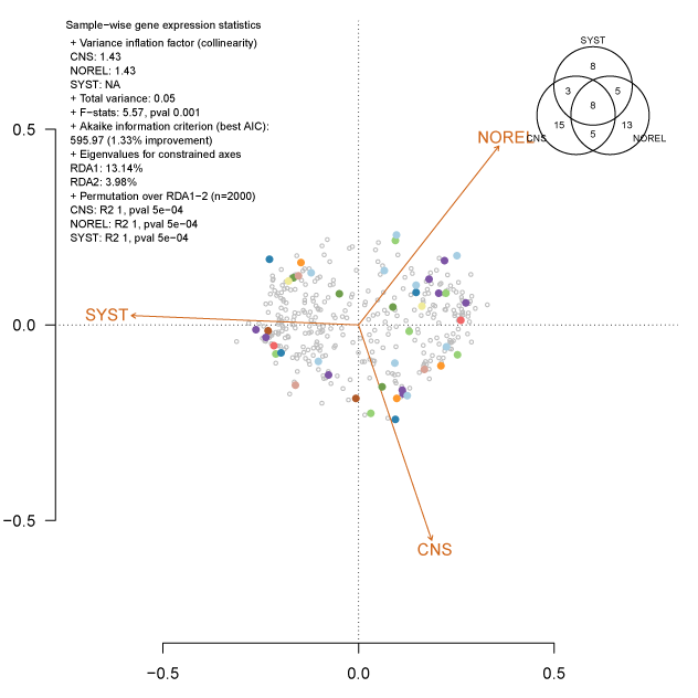
Redundancy analysis is one way to constrain with predictors (orange vectors below), a multi-space projection of the data (colored and grey dots). The dots represent genes and they were projected into hyperspace by fitting their residuals from expression profiles. Two genes with the same color belong to the same genetic network after creating a similarity and an adjacency matrix. Having these two genes constrained to one predictor, means that these genes are triggered inside the cell at one point in time to deliver a response. That response is the consequence of a mechanism, which can be proposed to be specific to that one predictor.
The code below will create this visualization showing many summaries and significance metrics. To output the real graph above, the full code and its context can be found on my GitHub.pdf(paste0("rda.bestLassoLambda.seed.pdf"))
par(mar=c(1,1,1,1), fig = c(.05,1,.05,1))
plot(rda.results, dis=c("cn","sp"), yaxt="n", scaling=3, type="n", bty = "n")
## project genes from network
axis(2, las = 1)
points(rda.scores, pch=1, col="grey", cex=.5)
## add vectors
## add centroids of factor constraints
plot(ena, add = TRUE, col = "chocolate")
## gene association to classes (colors only)
## distinguish genes selected by best lambda by minimizing the least squares
sel.mods <- colnames(dat[, -1])
genes2modules <- ids2modules[ ids2modules$genes %in% sel.mods, c(1, clustering.strategy)]
colnames(genes2modules) <- c("handle", "mods")
## add +1 to offset module 0
vcol <- (unique(genes2modules[, 2]) + 1)
for (co in vcol) {
sg <- genes2modules %>%
filter(mods == co)
points(rda.scores[rownames(rda.scores) %in% sg$handle, ],
pch = 16,
col = selected.colors[vcol])
}
## content of the legend from tests of significance
##legend("bottomleft", colnames(associations), pch = selected.forms[nl], cex = .8, bty = "n")
legend("topleft",
inset = -.01,
title = "Sample-wise gene expression statistics",
c("+ Variance inflation factor (collinearity)",
paste0(names(vs),": ",round(vs, 2)),
paste0("+ Total variance: ", round(tv, 2)),
paste0("+ F-stats: ",round(ana$F[1],2), ", pval ",ana[[4]][1]),
"+ Akaike information criterion (best AIC): ",
paste0(max.aic," (",round(100-((min.aic/max.aic)*100),2),"% improvement)"),
"+ Eigenvalues for constrained axes",
paste0(names(rda.results$CCA$eig),": ",round(rda.results$CCA$eig, 2), "%"),
"+ Permutation over RDA1-2 (n=2000)",
paste0(names(ena$vectors$r),": R2 ",round(ena$vectors$r,2), ", pval ", round(ena$vectors$pvals,5))),
cex=.7,
bty = "n",
horiz=FALSE)
par(fig = c(.7,1,.7,1), new = TRUE, cex = .6)
## Venn diagram showing redundancy between genes assigned to different subsets
## each specifically designed (categorized) to predict a class
try(venn(selgenes), silent = TRUE)
dev.off()