
Heatmaps should not be boring to visualize.
Genes that have correlated expressions cluster together. The closer these genes are in response-time and pattern of expression, the higher they are correlated. A pattern between two specific genes can be linear or non linear. Under a parametric approach, linearity can be seen as one mechanism being triggered at one point of time. However, more conditions can be factored in. For example, additional interactions between these genes and other ones due to abundance in certain ligands. These interactions are seen as hidden parameters, very significant in determining, the shape of clusters.
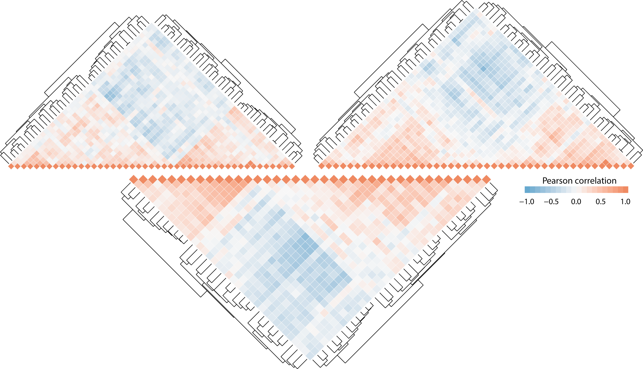
Below, the heatmaps originated from the same subset of genes. However, each profile is determined based on a unique pattern found between a unique set of genes. Those patterns are decisive in predicting specific cellular response on phenotypic traits.
Below is the code to extract meaning from gene expressions clusters.pdf("correlation.pdf", onefile = TRUE)
for ( lev in 1:length(selgenes) ) {
## get the genes that intersect
df <- adj.x[, selgenes[[lev]]]
cordf <- round(cor(df),2)
get_upper_tri <- function(da){
## function from the ggplot tutorials
## removes half of the correlation matrix
da[lower.tri(da)] <- NA
return(da)
}
## cluster and arrange correlation matrix
dd <- as.dist((1-cordf)/2)
hc <- hclust(dd)
cordf <-cordf[hc$order, hc$order]
## plot correlation matrix
corplot <- get_upper_tri(cordf) %>%
melt(na.rm = TRUE) %>%
ggplot(aes(x = Var2,
y = Var1,
fill = value)) +
geom_tile() +
scale_fill_gradient2(low = "#67a9cf", high = "#ef8a62", mid = "#f7f7f7",
midpoint = 0, limit = c(-1,1), space = "Lab",
name="Pearson\nCorrelation") +
theme_minimal()+
coord_fixed() +
theme(
axis.title.x = element_blank(),
axis.title.y = element_blank(),
panel.grid.major = element_blank(),
panel.border = element_blank(),
panel.background = element_blank(),
axis.ticks = element_blank(),
legend.justification = c(1, 0),
legend.position = c(0.6, 0.7),
legend.direction = "horizontal") +
guides(fill = guide_colorbar(barwidth = 7, barheight = 1,
title.position = "top", title.hjust = 0.5)) +
theme(axis.text.x = element_text(angle = 45, vjust = 1,
size = 5, hjust = 1)) +
ggtitle(paste0("Classifier genes for ",names(selgenes)[lev]))
## create dendrograms
dendro.data <- as.dendrogram(hc) %>%
dendro_data
dendro.plot <- ggplot(segment(dendro.data)) +
geom_segment(aes(x=x, y=y, xend=xend, yend=yend)) +
theme_minimal()
## add dendrograms to the correlation matrices
grid.newpage()
print(corplot, vp=viewport(0.8, 0.8, x=0.4, y=0.4))
print(dendro.plot, vp=viewport(0.665, 0.17, x=0.488, y=0.85))
print(dendro.plot + coord_flip(), vp=viewport(0.17, 0.667, x=0.85, y=0.435))
}
dev.off()
try(dev.off(), silent = TRUE)